By Dale Wayne Slusser
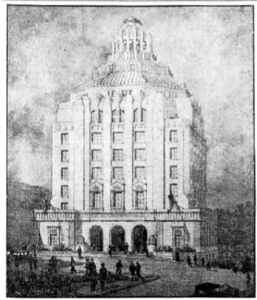
Asheville’s City Hall building was designed by Douglas Ellington in 1926, following on the heels of his commission for the First Baptist Church. Ellington’s design for the City Hall would continue his blending of Art Deco with his Classical training.
With his design for the City Hall, Ellington also prepared a design for a complimentary building to house the Buncombe County Courthouse, which was to be built on an adjacent lot. He had hopes of obtaining both commissions and had even prepared an architectural rendering showing both buildings, joined by a stone arcade. Ellington’s designs for both buildings, were “rendered in a modernistic style intended to reflect the prosperous cosmopolitan atmosphere of the time”.1
Ellington’s hopes seemed realized when on July 6, 1928 the City of Asheville and Buncombe County signed a contract agreeing to erect twin buildings. But alas Ellington’s ideal fell victim to political wrangling. The County Commissioners, who apparently did not like Ellington’s progressive design, and perhaps wanted to assert their individuality from the City, gave the commission for the County Courthouse to architects, Millburn and Heister of Washington, D.C.
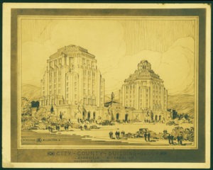
Even the Federal Fine Arts Commission, who was appealed to by the B. Frank Gudger, chairman of the Asheville Planning Commission, determined after numerous meetings with the City and County commissioners that: “The proposition now made to change entirely the style of the county building and to erect on the county site a building based on classical precedents, which shall be yoked with one based on Romantic antecedents is calculated to produce discord and seriously to impair the impressiveness, and dignity of the Civic Center itself.”2 The Commission went on with the alarming and dramatic warning that, “Such a mistake once made, never could be rectified without tearing down either one of the buildings.”3
Although I agree with the Fine Arts Commission’s assessment that Ellington’s grand design for twin buildings would have been more pleasing, and that it did “impair the impressiveness” of the proposed Civic Center design, I take issue with its assertion that the City Hall was “based on Romantic antecedents” in contrast to the county building being “based on classical precedents”. Asheville City Hall, like Ellington’s design for First Baptist Church, was based on classical precedents blended with “romantic antecedents” utilizing Art Deco forms and motifs.
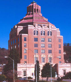
The basic massing of the building follows the Classical Architecture principle called “The Rule of Three” or “tripartite organization”. Vertically, the City Hall is divided into three parts to represent the three parts of a classical column. The lowest floors which are clad in marble represent a column’s base, the middle floors, mostly rendered in brick represent the shaft, and then the seventh floor cornice represents a columns capital. This tripartite vertical division had been being utilized by modern architects since the invention (in the late nineteenth-century) of the skyscraper and was a noted characteristics of the “Chicago School” architects such as Louis Sullivan, Daniel Burnham, William Le Baron Jenney, John Root, and the firm of Dankmar Adler.
Foreshadowing the 1980’s and 1990’s Postmodernist movement, Ellington’s entablature at the top of the marble-clad first floor, is highly stylized and features oversized modillions. This Mannerist treatment extends to the paneled marble nameplate over the main entrance, with its grouped and oversized modillions, which elude to, but does not follow, the canonistic rules of Classical design.
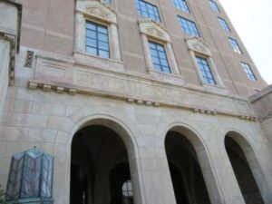
Ellington also exercised the “Rule of Three” horizontally, on each façade of the building, especially evidenced on the building’s front façade. The front or principal façade is divided into three major bays, in an A-B-A pattern, with the center bay (B) further subdivided into three bays, emphasized on the lower floor by three arched openings into the entrance loggia, and on the second floor by three windows, each surround by marble columns and pediments.
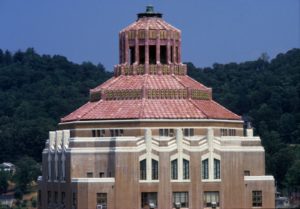
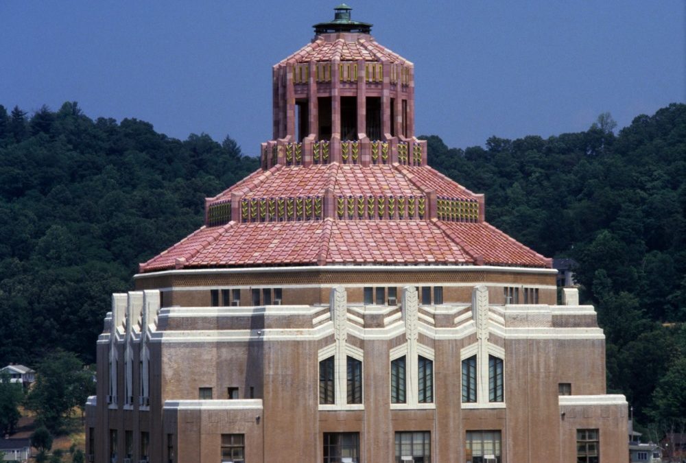
The pyramidal layered roof, with its brightly colored terra-cotta tiled roofing and stylized lantern/cupola set on an octagonal base is akin to a classical dome and in fact is reminiscent of the dome on the Baptistery of San Giovanni in Venice, a scheme Ellington first proposed for First Baptist Church. But it is here that we see Ellington’s masterful blending of Art Deco design, as in the place of classical cornices, the two levels of the roof are separated by “angular pink Georgia marble piers between which are precise vertical rows of ornamental green and gold feather motifs.”4 The use of the feather motif, which is used elsewhere on the building, was described in a contemporary account, “[…] as being lightly reminiscent of the Indian epoch”.5
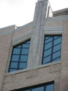
The Native American reference was further represented by the six-floor windows (center group of three on each facade) which seem to represent not just feathers, but an entire arrow. The allusion is of an arrow that has been shot from above into the cornice. The casement windows with their angled muntins mimic feathers, while the stone center mullions between each casement represent the arrow whose tip ends at the window’s sill, the arrow’s shaft is sculpted into the center mullions and the feathers at the end of the arrow rise above the cornice as if they had not fully penetrated into the wall. The allusion is heightened as the cornice at the mullions angle upwards seeming to signify the wound from a piercing arrow.
To my eye, as an architectural historian, Ellington’s design for Asheville’s City Hall reminds me of the work of another of his contemporary architects, Paul Cret. Paul Philippe Cret (pronounced “Cray”), was born in Lyons, France in 1876, and like Ellington, he studied at the École des Beaux Arts (1897 to 1903). In 1903, Cret accepted a position on the faculty at the University of Pennsylvania. Cret, who helped establish the university’s school of architecture as one of the most influential in the United States, remained on the faculty until his retirement in 1937. Cret also had his own architectural practice, where he concentrated heavily on civic buildings, to which he brought a steadily more refined style of Beaux-Arts classicism.6
Architectural critic Witold Rybczynski’s description of Cret and his architectural work could easily be a description of Ellington:
By education and temperament Cret was a classicist. But he was also a pragmatist, believing that classicism had to be adapted to the needs and tastes of the modern world. To that end, he developed what he called New Classicism, which dispensed with the Greek orders but preserved a classical sense of proportion, balance and symmetry.
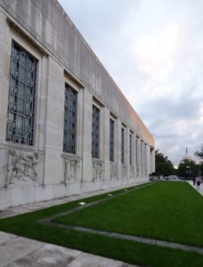
Although Ellington was a student at Drexel University, near the University of Pennsylvania where Cret was teaching, and although both men studied at the École (not at the same time), and both served in World War 1, I’m unable to substantiate that Ellington was inspired by Cret, but the similarity in in their design strategies is uncanny. Let’s look at just one example, Cret’s design for the Folger Shakespeare Library in Washington, DC. Designed in 1930, it postdates the Asheville City, but it serves to illustrate the similarities in Ellington and Cret’s design strategies. Like the City Hall, at first glance the Folger appears to be of the Art Deco style, but upon further investigation, we see that it was designed in a “stripped classical” style utilizing Art Deco motifs and ornamentation. The Library’s massing and window placement between fluted vertical panels which resemble the shaft of a column belie its Classical roots, as does the sculptured panels below the windows. And yet instead of classical windows and window surrounds, the building has Art Deco paned windows and layered window and door surrounds, a distinctive Art Deco motif.
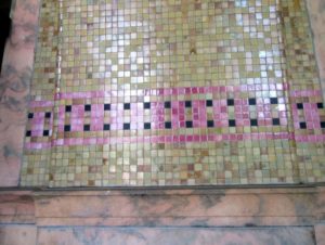
Ellington and Cret, as a result of their Beaux Arts training, viewed architecture as a Fine Art, and sought to integrate the Fine Arts into their designs. Cret looked to sculpture artists, mostly figural sculpture artists, to ornament his buildings. But Ellington, who was himself a proficient watercolor artist, ornamented his buildings with geometric or stylized naturalistic sculptured ornamentation and with an innovative and striking use of color. Masterfully, he used naturally colored materials such as brick and stone to achieve his desired color palette, augmented with brightly colored tile and art glass. We see Ellington’s proficiency in colorization on the City Hall, beginning with his use of mottled pink Georgia marble for the building’s base, combined with the beige “soil- like” colored brick walls above all crowned with brightly colored green and gold roof tiles. These pinks, greens, and beiges which he used to represent the colors of the mountains were also used for the mosaic tiles which line the walls and ceiling of the interior of the entrance loggia.
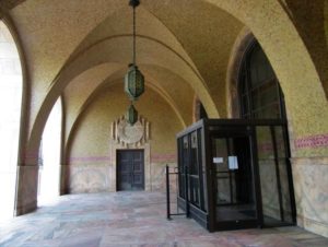
Speaking of the loggia-the main entrance to the building is via a groin-vaulted loggia, splendid in both detail and color. The groin-vaulting has its roots in ancient classical architecture. The vaulting and upper walls of the loggia are covered in colorful mosaic tiles, reminiscent of ancient Roman buildings. Here again we see Ellington’s blending of Art Deco with classical design, as instead of the mosaic tile forming figural or scenic motifs, the tiny square tiles are used most simply to provide overall color and geometrically to form one band that circles the loggia just above the marble wainscoting. Another striking feature of the loggia are the two carved marble crests of the City Seal which are above the north and south entrance doors.

In place of ancient sphinx guarding the entrance, Ellington designed, at the north and south ends on the exterior of the loggia, monumental Art Deco lanterns set on plain marble bases. The copper and art glass lanterns again suggest the feathers of an arrow.
Just as he had done in his design of the First Baptist Church, Ellington has successfully used both canonical rule and invention, along with the color sensibilities of an artist, blended with modern Art Deco design, to create an architectural masterpiece which has endured and still functions as its intended purposes, both as the house of local Civic government, but also as a symbol to proclaim that the City of Asheville is not only progressive, but also a City dedicated to the Cultural and Fine Arts.
1 Clay Griffith, “An Inventory of Douglas Ellington’s Architectural Work in North Carolina”, article in May We All Remember Well, Vol. II, by Robert S. Brunk, Editor. (Asheville, NC: Robert S. Brunk Auction Services, Inc., 2001). p. 95.
2 Asheville Citizen-Times, February 22, 1927, p.3.
3 Ibid.
4 https://www.nps.gov/nr/travel/asheville/cit.htm
5 Image dcba004-http://toto.lib.unca.edu/booklets/dedication_city_building/default_dedication_city_building.htm.
6 https://architectural-world.blogspot.com/2008/05/paul-cret.html
Photo credits:
Postcard view: North Carolina Collection Image # AC735, Pack Memorial Library.
Rendering of Asheville City hall: Asheville Citizen-Times, February 22, 1927, p.3.
Rendering of proposed twin buildings: https://packlibraryncroom.files.wordpress.com/2015/02/m844-8.jpg
Asheville City Hall photo: https://www.nps.gov/nr/travel/asheville/buildings/cit1.jpg
Nameplate and Arches: photo by author.
Roof and Lantern/cupola: Tim Buchman Photographs, 1988-1998 (MC00583), Preservation North Carolina.
Sixth-floor windows and Arrow mullions: photo by author
Folger Library: By Tony Hisgett from Birmingham, UK – Folger Shakespeare Library 2, CC BY 2.0, https://commons.wikimedia.org/w/index.php?curid=64146642
Mosaic tile in loggia: photo by author
Entrance Loggia: photo by author
Entrance lantern: photo by author

